Fine Lines
the blog
I thought it would be fun to share a little “behind the scenes” of what it takes to move a new brand from initial idea to execution.
So let me introduce you to Emily! I first met Emily in May when she was in the early stages of wanting to develop a brand and blog for her mentorship business.
Emily was already the founder of multiple successful businesses including Emily Jane Photography and White Willow Bridal Boutique in Prince George, Canada. Her mentorship business had grown through word of mouth alone over the past several years yet it had never had a “home” of its own—which is where Luminous Lines came in.
Our Brief:
Create a brand (SHE—by Emily Jane) that is seen as giving back; being informative, aspirational and motivational. Attract millennial professionals through modern design while still incorporating Emily’s personality. Pair this with a user-friendly blog that is fresh and vibrant so Emily has a place to speak about business and life, and connect with those who need guidance and uplifting.
After having Emily complete an initial branding questionnaire, my branding strategist (Tahnée of The Strategy Studio) and I got to work.
The first step in the development of any branding project is to establish the following:
Brand Purpose & Essence—Why does your band exist and what does it stand for?
Target Market and Ideal Client—Who is your brand going to serve?
Brand Tone—What does your brand sound like when it talks?
Brand Descriptors—How do you imagine your brand looking and feeling?
It’s at this stage in the process clients often ask “But is all of this really necessary? I just need a logo”. And my answer every time is a resounding YES!
A brand is so much more than a logo. It’s a way of communicating—through elements such as colour, font, typeface, imagery and language—with the intention of connecting with an intended customer or client.
If you don’t know what your brand stands for and who you want to connect with, you will end up resonating with no one (and probably having spent a LOT of money).
Concept Boards
So once Tahnée had helped establish all of these aspects for Emily, I was able to draw on this information to create unique concept boards which show proposed brand colors and visuals.
You can see each of these below
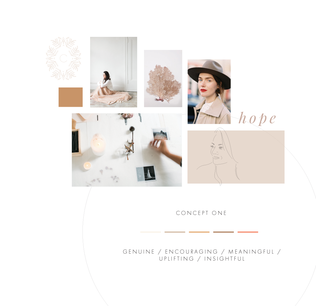
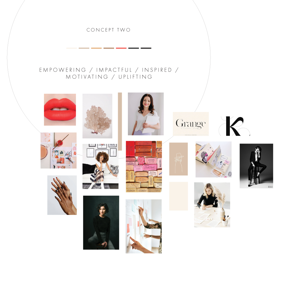
You’ll notice one is more bright, bold and empowering, the other being more understated, peaceful and encouraging.
Designing the Full Brand Suite
It’s at this point we presented our initial ideas to Emily to seek her input and feedback so we could refine the direction before moving into the design of the full brand suite.
As is very often the case, Emily was drawn to specific elements from each of the concept boards, so I was able to rework the visual strategy to help reflect this, as you’ll see below.
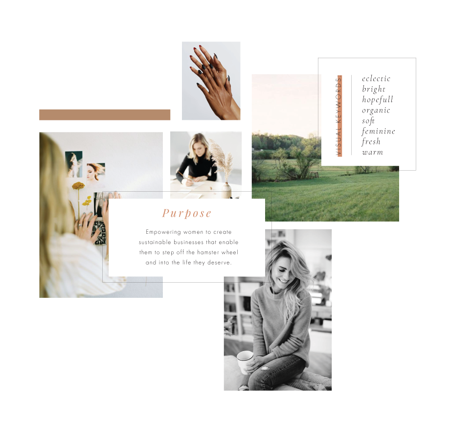
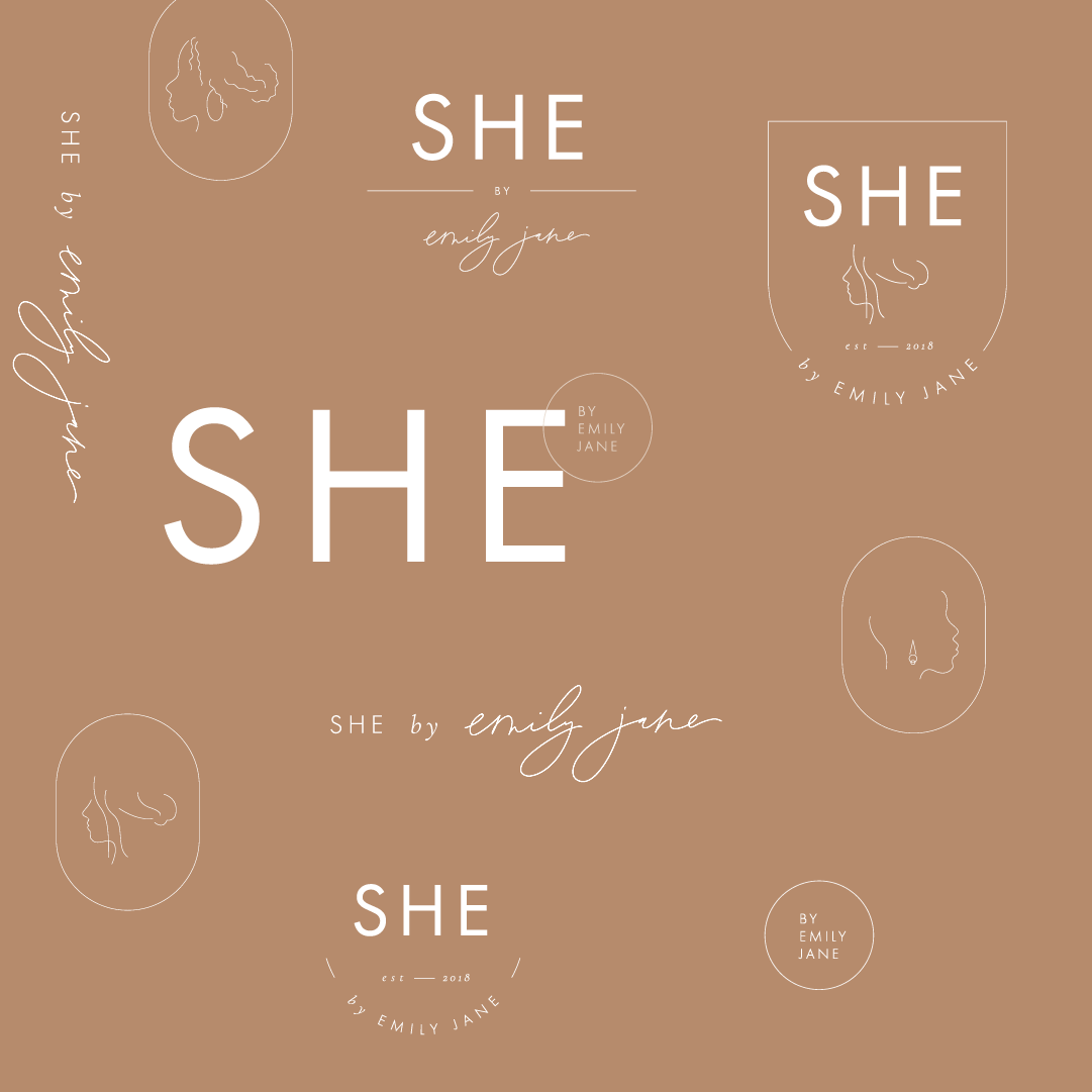
The final stage of the brand design is the biggest. It’s when I take this visual direction and transform it into an entire brand suite including logo, color and typography, while also demonstrating the various ways these elements could live out as a full brand in digital and print applications.
You can see some examples of this below.
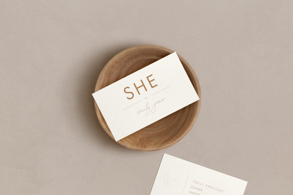

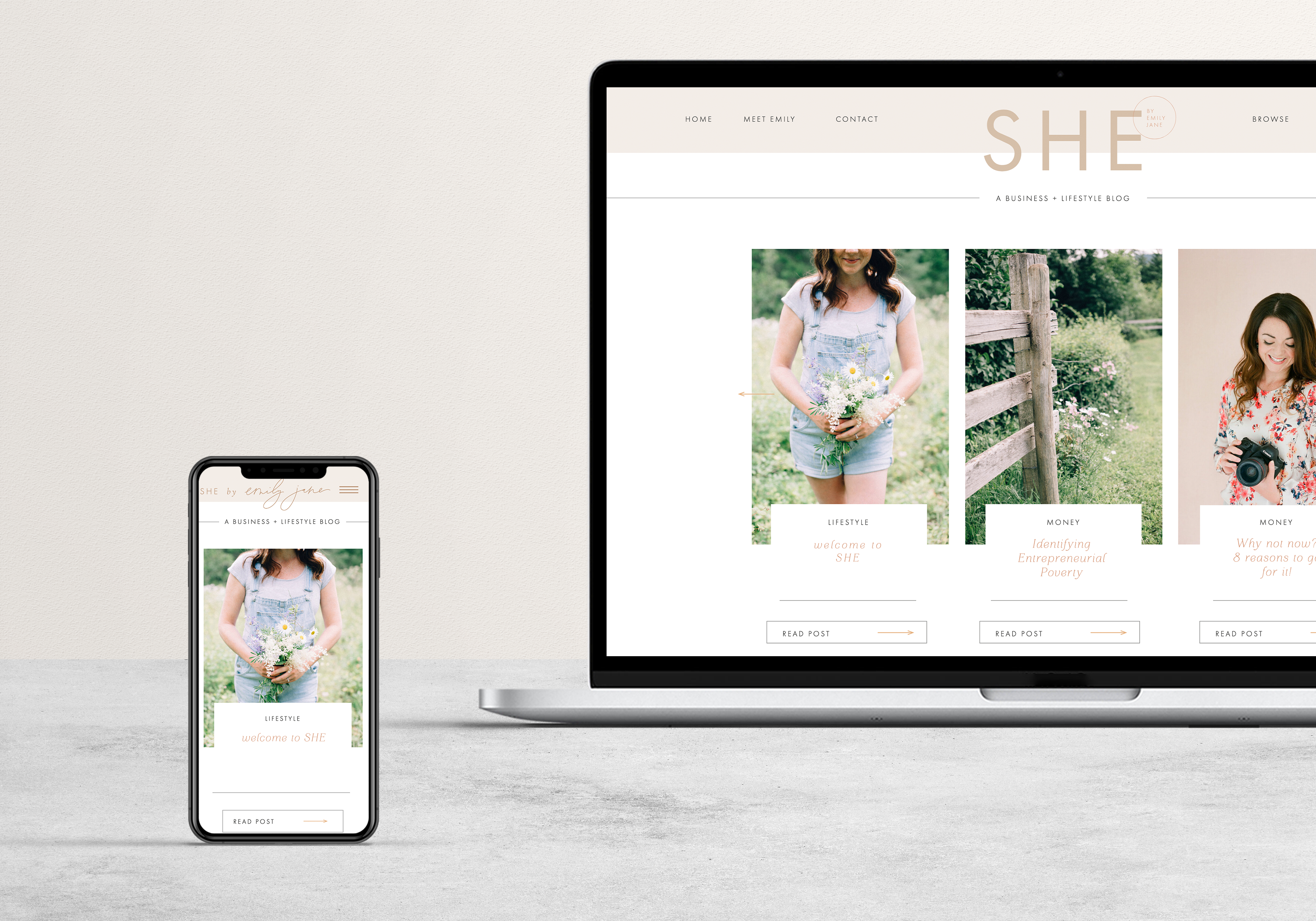
Emily loved the direction we’d developed for SHE, with the final design only requiring a couple of minor tweaks before it was launched to the world this month.
You can take a look at the SHE brand in action by visiting https://shebyemilyjane.ca/ and following @shebyemilyjane.ca on Instagram.
It was such a pleasure to help Emily develop her new brand and website, and I can’t wait to see the community she builds and empowers with SHE
I’m a brand and web designer, stylist and strategist. I work with talented and seasoned professionals to design strong brand identities that help improve their businesses. I’ve supported many entrepreneurs in further defining their brands through thoughtful design that not only appeals to their audience visually, but strategically.
